
Have you ever wondered how to get the perfect color palette for a multicolor project? The secret is surprisingly simple color theory! When selecting your colors, there are two important things to keep in mind: hue and value. To illustrate these, I’ll be using the same Fair Isle pattern with a variety of color combinations.
Let’s start with hue. This is the basic color that you’ll be selecting. To see how multiple hues work together, it’s important to look at a color wheel. Here’s a very simple version:

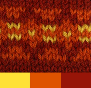
How you select hues from the wheel will depend on the effect that you’re trying to achieve. In general, remember that colors that are closer together will blend together more, and colors that are directly across from each other will provide the most contrast. So if you want a subtle look, select colors that are next to each other on the wheel. These touching colors are called analogous hues, and they can help you create delicate transitions and color gradients. I’ve selected yellow, orange, and red for my subtle colorwork.
If you want your colors to really pop, select complementary colors. These are located directly across from each other on the color wheel. Using complementary colors will give your colorwork a lot of contrast. Let’s see how changing the swatch looks when I replace one analogous hue with a complementary one. I’ve replaced the rusty red with a blue-violet shade.
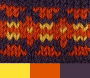
Blue-violet is across the color wheel from yellow and orange, so it provides a lot of contrast.
Now, let’s move on to value. Value is lightness or darkness of a color. Imagine you have a colored pencil and a piece of white paper. No matter what, you’ll be using the same color, but the value changes the appearance. If you color super softly, you’ll end up with a very pale value; if you press very hard, you’ll have a very dark value. To create contrast, select yarns that have different values.
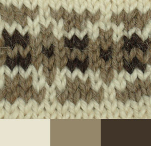
Here, I’ve selected yarns with the same color but varying values, from the almost white to the rich chocolate. The difference in brightness creates a nice contrast, allowing my Fair Isle pattern to stand out.
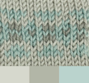
In this swatch, I’ve used yarns with different colors but similar values. As you can see, this creates very little contrast. The same thing will happen if you pair multiple dark shades together; closer values will have less contrast than varied values.
So all you have to remember is that yarns with analogous hue and similar value will create subtle combinations, while yarns with complementary hues and varied value will create contrast. Have fun and experiment! And remember, crocheting or knitting a quick gauge swatch is the best way to see how colors will behave together!
Jeanchambor
What’s hardest, is when buying online, you can’t combine other swatches together to see what they will look like in your work.
Miaren Crowsdaughter
One thing I’ll do is do a screen-shot (there should be a key on your keyboard to do this), and then paste into MSPaint or another graphics program. Then I can shuffle the swatches around to compare them. It’s not perfect, but it usually gives a fairly good substitute for being there in person.
Anonymous
Hi, Jean. Aside from Miaren’s great suggestion, I’d recommend using Microsoft Office (or any word processing software) as a tool for color pairing. Simply right-click on the color swatch online and select “Copy Image”. Now, go to your Word document, right-click, and select “Paste”. The swatch image should now appear in your document. As a bonus, you can type up all of the names of the swatches and save them in the document, then you can print them as a shopping list to take to the craft store. I hope that helps!
Mmgandco
Thank you for your information on the color combination, how easy to do. I will surely try this method!..
Color theory for your knitting projects | SheeptoShawl
[…] More here. […]
How to Pair Yarns to Create a Unique Look: A Personal Experience with Double Stranding | Lion Brand Notebook
[…] Color family: Do you want your colors to be complementary, or do you want contrasting colors? For more information on experimenting with color, check out this blog post by Jess on Color Theory Basics for Knitting and Crocheting. […]
Custom Bear Hugs
Such a great way to demonstrate this topic. Thank you!
Expertise from Waterloo Knitters Guild | thepleasantestthing
[…] Lion Brand Yarn: Color Theory Basics for Knitting and Crocheting:Â Â http://blog.lionbrand.com/2012/01/18/color-theory-basics-for-knitting-and-crocheting/ […]
Denise Sullivan
Thanks so much for the tips. Very helpful it is much appreciated.
Megan
So Helpful! Thank you!