
In this guest post by Phyllis Alberici, we discover how we perceive color, and how it affects us.
I’m wearing my bright yellow sweater today. The sun is shining and the daises are blooming. I’m loving life. Yellow does that to me. How do different colors affect you?
In the Fifties, as America emerged from two wars, color was making a comeback. Remember those big saucer sized clip on earrings in bright yellow, red lipstick, and poufy skirts and pedal pushers in summer colors? If you don’t, that’s OK because the Sixties were just ahead.
The Sixties were a time of tremendous change in the way we looked at color palettes. Colors were thrown together in the same paint pot and the result was an eye melting psychedelic interpretation of the color wheel. Tie dyed red, pink, purple, teal, yellow and orange walked the fashion runway together. Color had gone wild.
Color theory, which gained popularity in the Fifties and Sixties, along with Technicolor films and glossy movie star magazines, tells us that certain colors affect us more than others. Yellow is cheerful, red sparks strong emotion, peach is sublime, blue is calming and lifts our spirits, green centers us, black is sophisticated.
But what if there is no such thing as color? What if I told you that color is just a bunch of light wavelengths that hit the back of our eyes? It can’t be!
It’s all about physics. Light travels in wavelengths and those waves hit the back of our eyes in an area where the cones are gathered. These tiny receptors are each color coded so that one “sees” red, the other blue and so on. Our brain gets involved by interpreting the signals the cones send to it and the brain says, “Hey, that’s red.”
Our brains give us some pretty sophisticated data to work with and we interpret what it sent out as bright red, maroon, or even pink. All that really exists is those light waves. There isn’t any color. Color is a product of our amazing neurological system.
The light source under which we view color signals is important. If we’re in low light colors darken until navy blue looks like black. Our system shuts down. If we’re in fluorescent light then everything seems to wash out. How many crafters say, “I wish we had better lighting so you could see these colors better?” Artificial light causes colors to shade and confuses our color perception so that white might have a pink or blue hue. But it’s not real. If it wasn’t for the cones in our eyes we wouldn’t see color at all.
And this is where memory comes in. We carry a memory of color from our childhood, from clever marketing, from memorable events in our lives. We gravitate toward certain colors and shun others. Our brains store color memory in an intricate filing system that we can pull out when we buy clothes, decorate our homes, buy a car, or buy yarn. So go ahead, try new colors. Remember, you’re making memories.
Have you ever had a change of heart when it comes to color preferences? What colors do you gravitate to when selecting a pattern?
 |
 |
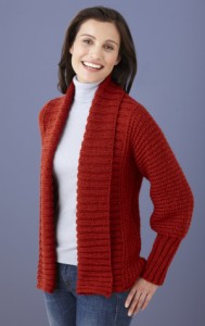 |
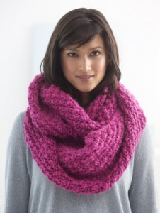
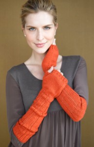
| Knit Cabildo Cowl made with Hometown USA® | Knit Sparrow Fingerless Gloves made with Sock-Ease™ | Knit Drapey Cardigan made with Vanna’s Choice® |
 |
 |
 |
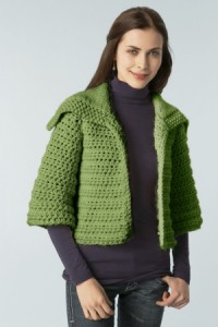
| Crochet Curvy Girl Tunic made with Heartland® | Knit & Crochet Retro Swing Cardigan made with Hometown USA® | Crochet Everyday Elegance Cardigan Made with Vanna’s Choice® |
Giầy Converse
I like warm colors, especially in winter.
Kathryn Pless
My color choices seem to change after a while. I was really into jewel tones for years, but now this summer I seem to gravitate toward bright neon colors.
Jon Edward Jordan
I seem to gravitate toward the blues. Curiously, as a child, I had no interest in blue when most of the other boys seemed to.
Purrlie
I gravitate toward whatever colors are currently NOT in fashion. There are always the colors of the season or the year that’s are done to death in everything from clothing to house paint to bedding to autos. They become deadly boring and old news very quickly (I was done with neons after the first week of seeing them). Currently, I’m very attracted to yellows and golds (but not neon highlighter yellow). But if yellow became the rage next week, it would lose it’s appeal and I’d be attracted to something else.
Diane
As a child it was blue all the way, especially the lighter blues. During my adult years I’ve gone back and forth between pink and purple. But just lately, I’ve really been gravitating towards green!
AuntieFran
I tend to believe that we “like” the colors that we wear well. I’m a RED person — anything from pale pink to deep burgundy.
Darcy Gardiner
I love yellow. Unfortunately for me I look about as ill as when I wear lavender-ish shades. So I do not agree. I have learned (finally) not to buy either color.
BoLyn
I was expecting some insight into why we gravitate toward certain colours at certain times, but instead got a grade-school biology course. Rather disappointing.
Mary Goodson
And a rather ignorant one at that. Saying that color doesn’t exist is as ridiculous as saying that smell doesn’t exist – it’s “just” that our nose scent receptors getting filled by microscopic scent particles. Well DUH. That IS what scent is. And our brains learning the different light wavelengths and how our language names them IS what we call “color”
Why do people post foolish things like this and call it an “article”?