
Many of you may ask why a yarn company would introduce a palette for a given year and they arrive at these choices.
Colors play an integral role in our daily lives, it effects our moods from the brand of toilet paper we buy to the clothes we wear, and especially the yarn we choose for our latest projects. The Design Department spent many months researching various trends from the world of crafts, fashion and home décor to come up with our 12 colors of this year, 2019. We research Trend Forecasting Websites, study the fashion collections for the upcoming seasons and travel, literally, around the world, to see what is popular in all aspects of color.
Lion Brand’s Color philosophy is two-fold. We want to inspire you with the latest high fashion colors, but we know how much time and love goes into every project you make so we try to keep the colors timeless and understandable.
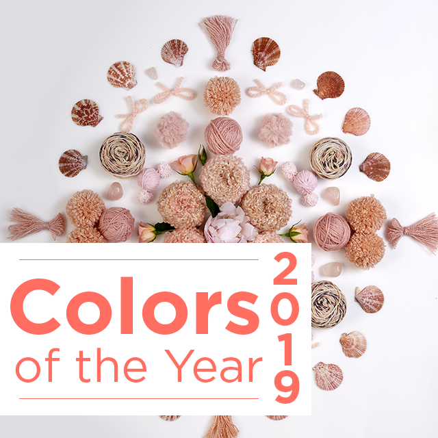
Here is our palette for 2019.
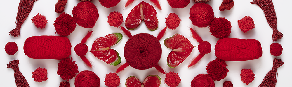
This bright pop of color gets its name from the Anthurium flower, a bloom native to the Americas.
The color inspires warmth, strength and opulent texture. The waxy finish on the petals evokes a subtle sheen that seems not from nature.
Bright red has slowly made its way into the neutral palette as it has been adopted into almost every collection of runway designers and we are not complaining.
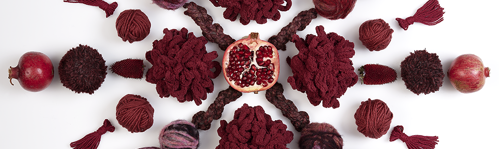
A mysterious fruit that is at once sweet and sour, Pomegranate is several colors at once. Its skin a deep crimson, it’s berries a rich dark currant, our Pomegranate embraces the spectrum of these hues. When worked up in lace and feminine silhouettes it takes on a romantic vibe, the deep burgundy also lends itself to gender neutral dressing and menswear inspired fashion.
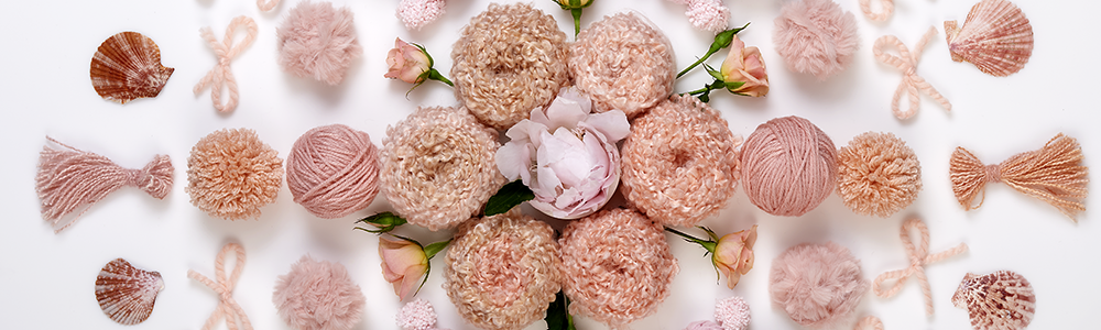
2019 Marks the first year that all children born in the new millennia are officially adults. This utterly modern orange tinged pink is no longer the saccharine pastel of baby layettes, it has taken on a more grown up attitude. Pastels in general have evolved beyond the nursery while sophisticated brights and neutrals are trending in babywear.
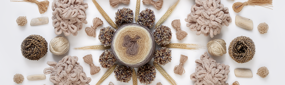
Yarn lovers flock to variations of this best-selling neutral as it showcases stitch-work and mimics the raw natural qualities of wool. Paired with brighter tones this color gives you a nostalgic quality with a contemporary pop.
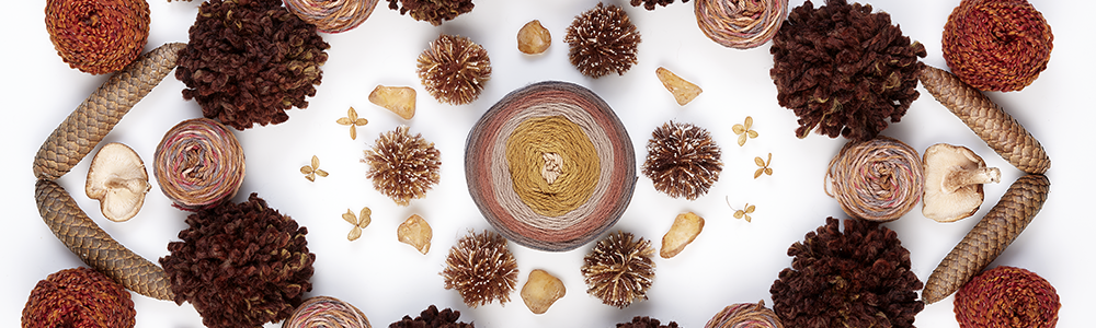
The name Kombucha is synonymous with the wellness trend that has permeated the zeitgeist over the last few years. The rich warm brown is more than a color, it is a philosophy that coincides with crafting. Talking the time out of the technology overload of your day to make something with your two hands is an integral part of self-care.
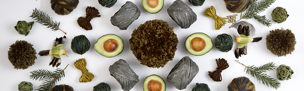
Another play on neutrals in this energetic green tone. It’s a season-less. versatile green that has been embraced by all categories. You can use it as an accent stripe or all over for a statement piece. Avocado embodies the spectrum of earthy green hues from its almost black skin to the creamy acid green of the fruit.
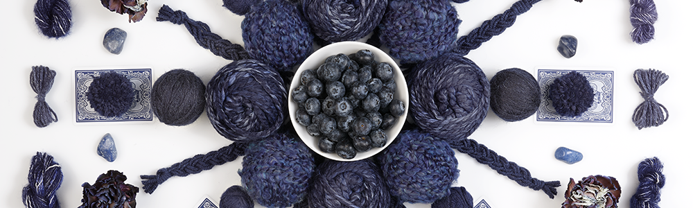
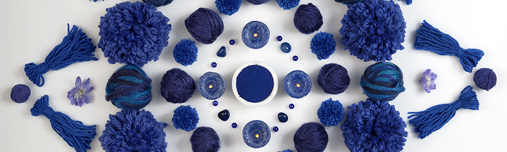
A deep mysterious blue, richer in depth than navy. A grounding force to our palette, this classic color looks freshest in combinations with other shades. It’s versatility, like a favorite pair of dark blue jeans, looks great on its own or against any other color in our collection of twelve.
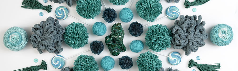
Malachite is a color of legend often found in ancient mandalas. This color has traditionally been associated with summer and swim products but has evolved into every day dressing.
This color is the perfect play on your royal blue. Cobalt evokes a sense of happiness, bringing us back to our childlike roots. Bright, rich and versatile – this color can be paired with other brights to evoke a playful geometry, or shaded with other tones of blue for an ombre effect,
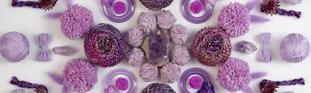
This icy version of orchid, is the perfect perfect purple of our time. Bridging the gap between delicate pastels and technicolor purple, Prism has a spiritual and calming quality. Prism is no shrinking violet: the color makes the perfect accent to any neutral.
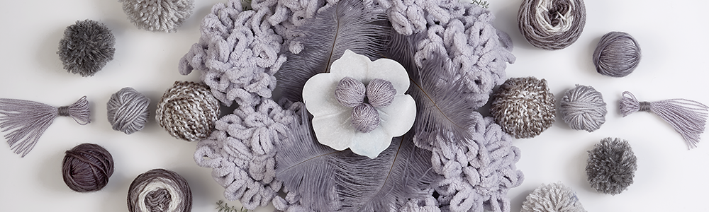
Grey has been replacing basic black as the go to color for head to toe dressing. Grey has been the most popular color in everything from house paint to Nursery décor. Like its namesake, Shade has an ephemeral quality. It can be a silvery white or a mysterious charcoal.
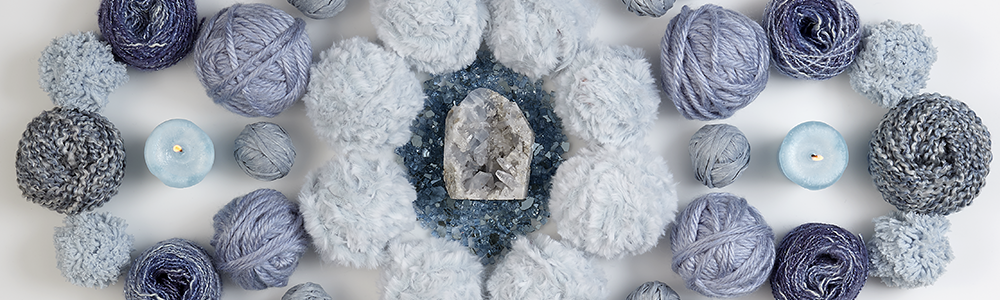
A frosted mid-tone that balances the bolder hues of our palette, raindrop has a phosphorescent intensity. No longer associated with traditional pastel blue, Raindrop exerts a strong influence in fashion especially when contrasted with darks.
This is just an introduction to our 12 colors of 2019. We have so much more in store for you. Stay tuned.
Tonda Stewart
I wish that yarn companies would listen and in sport as well as worsted weight give us flesh tones more and more people are making dolls we have a lack of flesh tones please give us fleshtones.
Tonda